

The Brief
Exploring different letter forms and shapes to find the right fit.
It all began with a brief.
DIGI, connecting 25+ million users across Europe, set out to renew its identity. It operates in Romania, Spain, Italy, Belgium, and Portugal. HelloYes and Kemistry led the rebrand and asked us to create a custom typeface that:
- Aligns with the new brand system and DIGI’s Arc symbol
- Feels friendly and open, and communicates trust through clarity
- Performs well across screens, print, and broadcasting
In short: turn a brand’s core shape into a working, geometric sans family.
It started with a clear direction and room to build.
The Role of the DIGI Arc
DIGI Arc is a key element of the DIGI branding and is fundamental to the development of the typeface.
A simple curve. It represents Connection. Support. Openness. The Arc sits at the heart of DIGI’s visual language.
A part of a whole. One curve, many readings: a smile, a sunrise, a bridge, support. One mark. Many meanings.
The task was clear: incorporate the Arc from the logo into the typeface’s letters.
Our challenge? Carry that curve through the typeface without losing readability. Let the Arc be felt in text, never shouted.
Shapes into Letters


Characteristic and fundamental elements for the creation of the typeface family
A geometric sans isn’t just circles and lines. It’s about the optical corrections. It’s about the proper spacing. It’s the experimentations. It’s testing, retesting, and the tiny nudges that make letters work together. And always – legibility first.
So we went for high x-height, minimal contrast, proportions drawn from circles, squares, triangles, and modern bones.
Ascenders sit a touch beyond the cap height for a better rhythm. The open terminals are on purpose – friendly, readable, on‑brand. Words breathe, but the text holds together.
We set the foundation: the Arc in a/s/n. Then the accents: R/K/Q— those are moments you notice just enough.
The Arc is not decoration – it’s structure. It serves a function: to make everything cohere.
Letters that feature DIGI Arc and give the typeface more of its own spirit
Building the Family
DIGI Sans: All six weights, from Thin to Black, plus corresponding italics.
One style won’t do. Real brands need range. Together with HelloYes and Kemistry, we planned a family for real‑world use:
- Six weights – Thin, Light, Regular, Medium, Bold, Black
- Matching italics – for every weight
- Condensed width – about 25% narrower for tight spaces
The result: consistent typography across websites, apps, outdoor ads, and broadcast graphics.


DIGI Sans Condensed: Around 25% more compact compared to the normal version.
Highlights:
- High x-height; minimal contrast
- Ascenders slightly above cap height; balanced descenders
- Open terminals for clarity and tone
- Arc integrated in core letters; signature moments in R/K/Q/a
- Six weights + italics; Condensed ~25%
- OpenType: tabular figures; superscripts and subscripts; stylistic alternate “i” (curved) for display; default straight “i” for small text
- Language coverage: Latin + Latin Extended, incl. Romanian (Ș/Ț comma‑below), Spanish, Italian, Portuguese
- Italics at 11.3° – drawn: auto‑slanted, then corrected glyph‑by‑glyph to match the uprights
- Condensed: hand‑drawn, sign‑by‑sign; not squeezed; re‑spaced for tight layouts
- Variable Fonts: two – Standard + Italics; Condensed + Condensed Italics
Engineering the Details


Base Latin alphabet of DIGI Sans.
Is it Art? Yes. But what about engineering? Absolutely.
What we did:
- Fine-tuned spacing and kerning
- Tested rendering across operating systems and devices (major Windows and macOS apps)
- Checked readability at multiple sizes and contrasts
- Improved functionality to serve the needs of DIGI


Full Latin glyph case of DIGI Sans.
We shipped early builds to DIGI’s design teams – to get real feedback, in real contexts: UI, broadcast, print. It shaped spacing, rendering, and features. The process is a discussion; the purpose is cohesion, making it all fit together.
FAQs
Why choose a custom typeface over an existing font?
- Personality
- Precise message and tone
- Flexibility across media
- Simpler licensing
- Full Ongoing Support
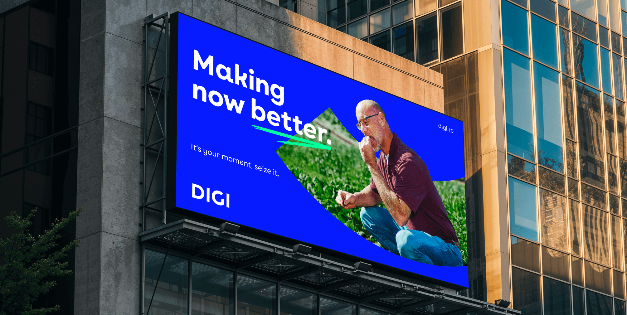
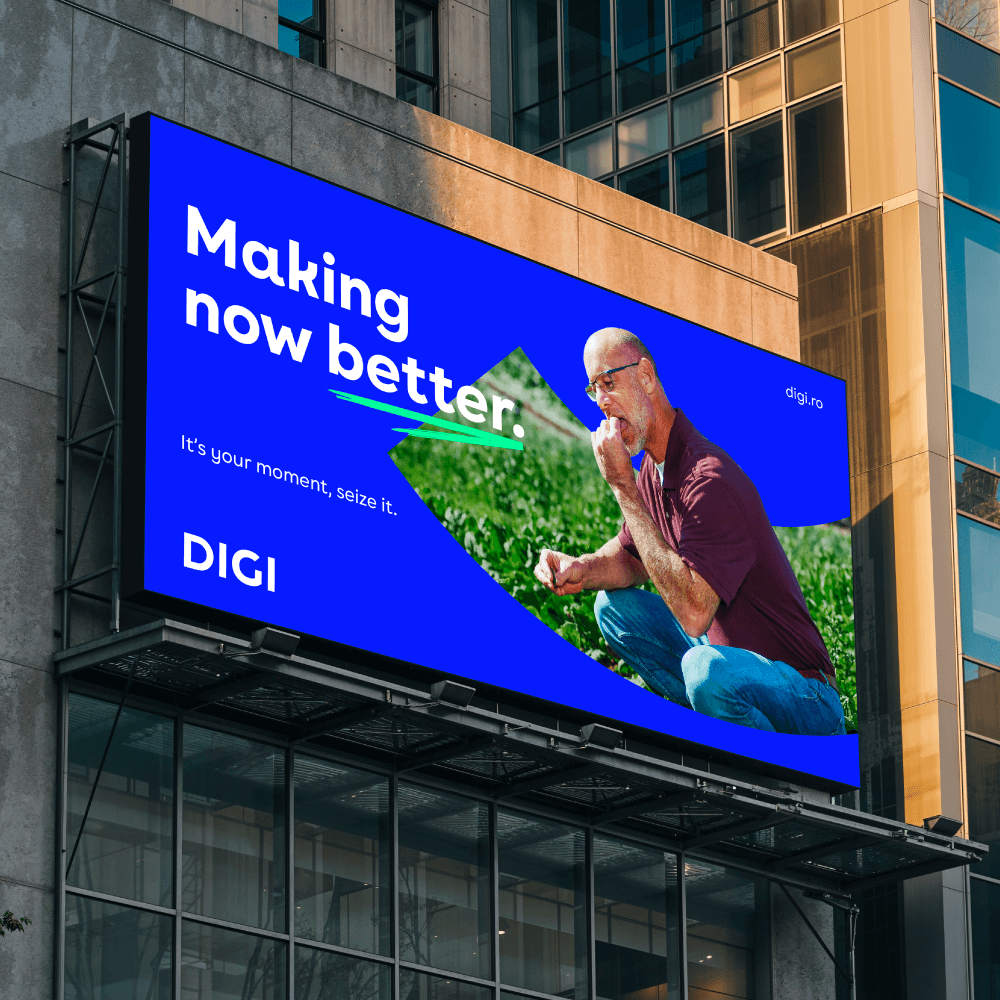
DIGI Sans in use
How long does it take?
Typically, it takes about six months from the first sketches to delivery, depending on the scope.
Can it support multiple scripts or languages?
Yes—full support for the scripts/languages you request.
The progression of DIGI Sans from the initial idea through the development of the curves and the glyph set to the ready-to-use font software.
Interested?
Every brand speaks – through logos, colours, and type. If you’re exploring a custom font for a rebrand or want a made‑to‑measure typeface, let’s talk.
It starts with a brief.
It’s a discussion.
It answers many questions.
And finally – it makes sense.

