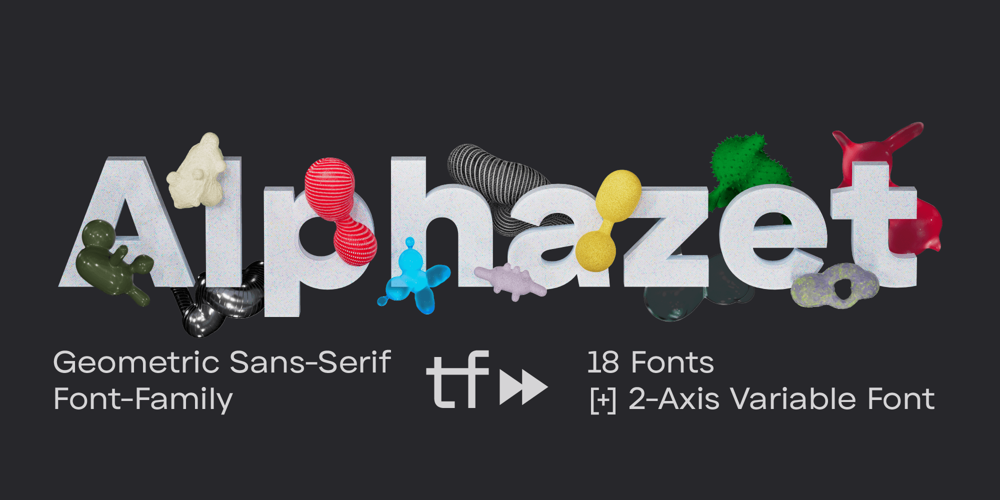
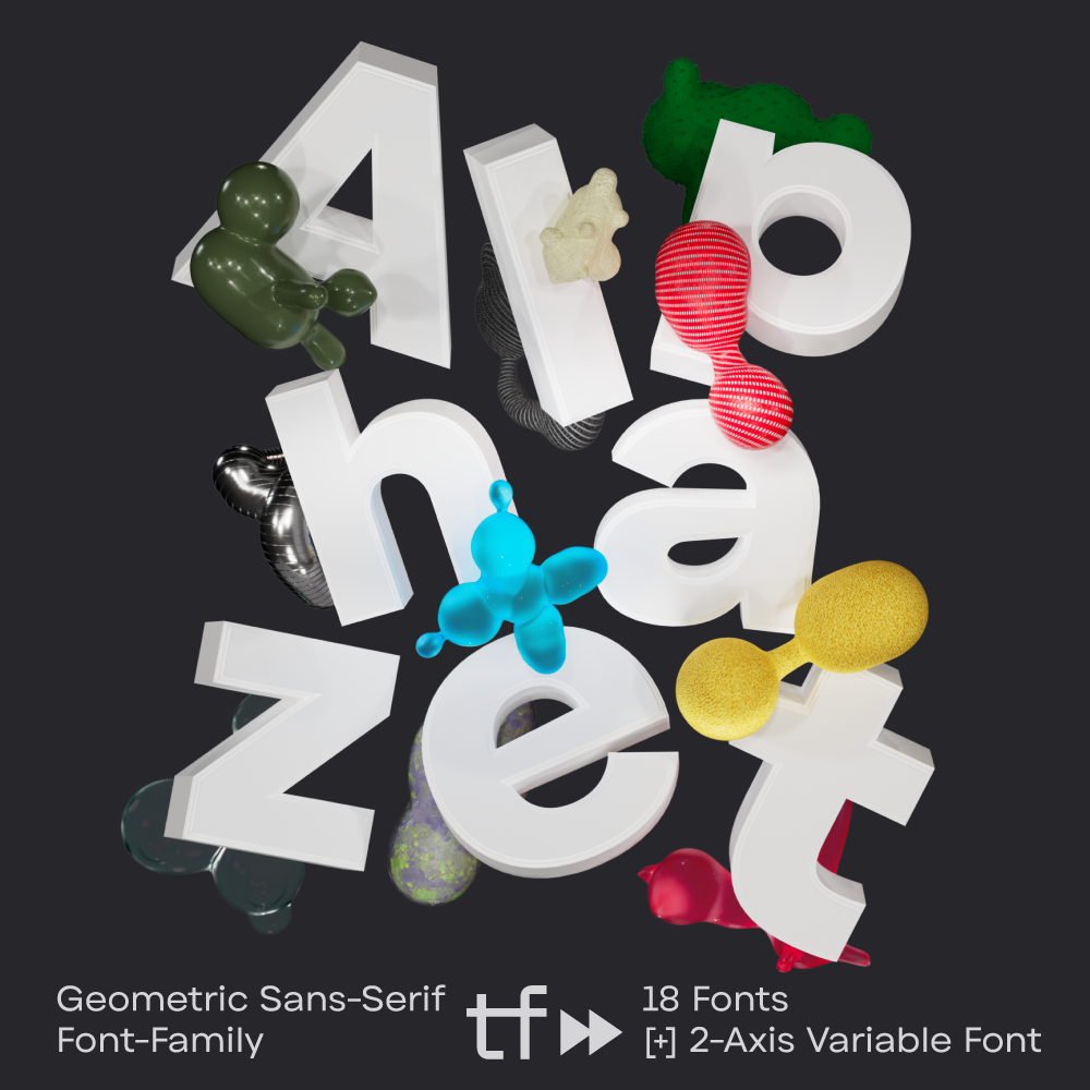
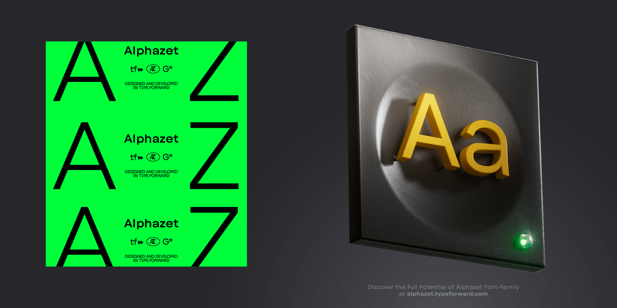
Alphazet is a geometric sans-serif with minimal stroke contrast and slightly wide proportions for improved readability.
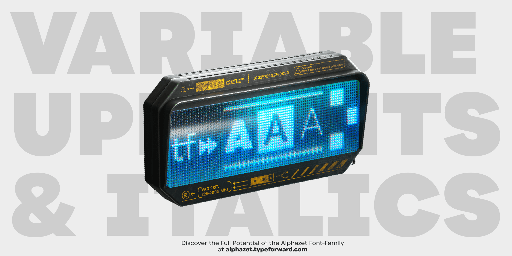
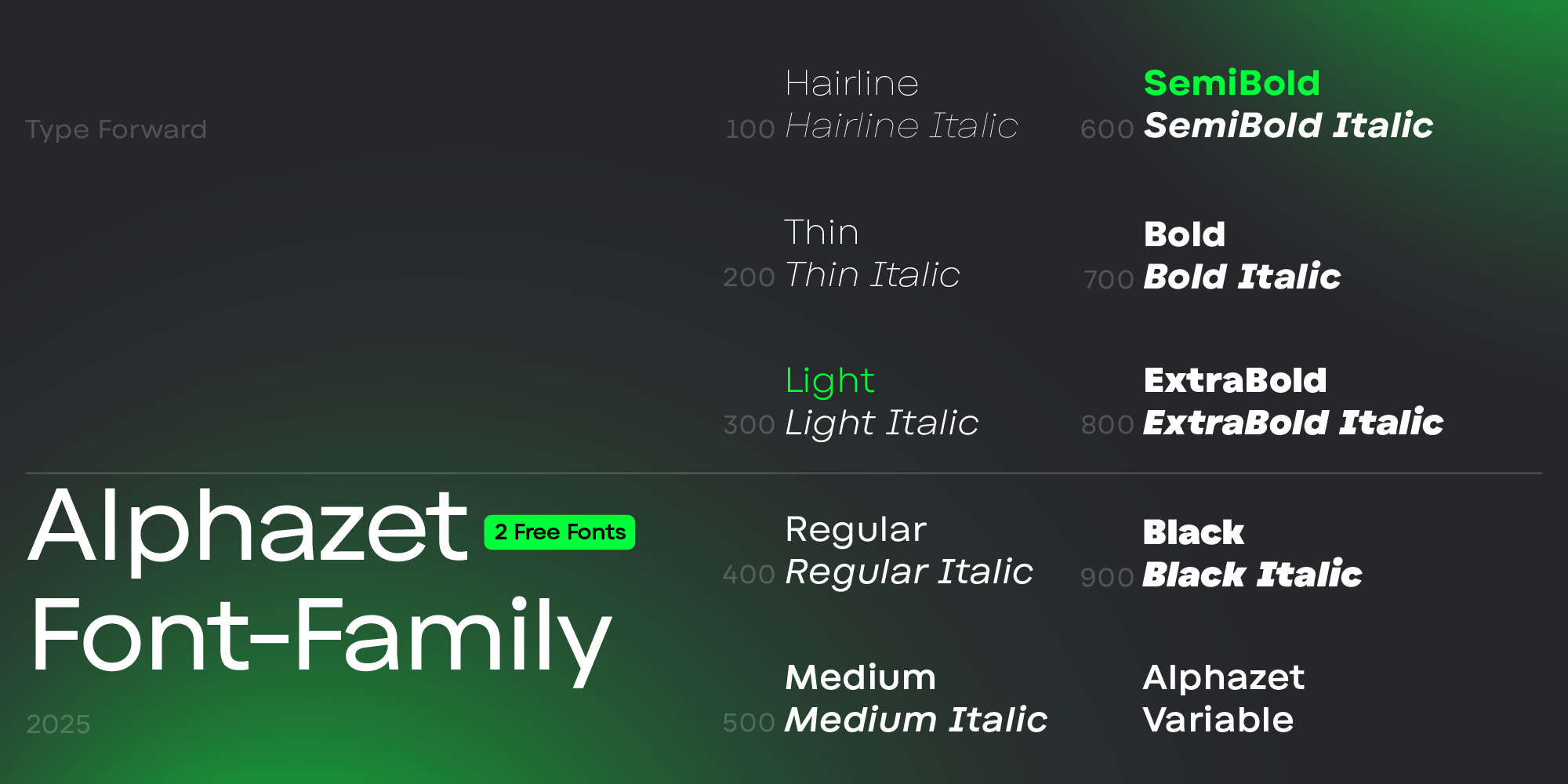
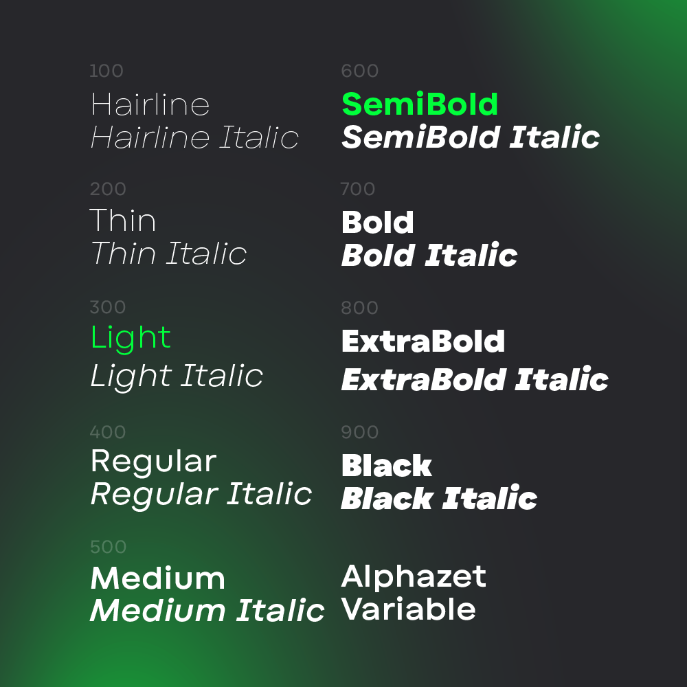
It includes 9 weights with matching oblique italics, all available as a variable font. With broad language support, OpenType features, and well-balanced spacing and kerning, Alphazet works well in both body text and display settings.
_______________
Developed by Type Forward and Luboslav Boyanov, Alphazet is based on geometric principles and designed for practical use. Its high x-height and stable proportions support legibility across a range of sizes. The typeface performs reliably in both extended reading and short, impactful text.
Alphazet is constructed from simple geometric forms, focusing on consistency and space efficiency. Short ascenders and descenders make better use of vertical space, and consistent weight distribution ensures uniform text color. The design avoids decorative details, maintaining a steady rhythm across lines.
The family includes 9 weights (Thin to Black), each with matching oblique italics. It is available in OTF, TTF, web formats, and as a single variable font file for flexible use. Alphazet suits a range of applications—from body text to headlines. Its proportions and spacing support readability at small sizes, while its structure remains strong at larger scales, such as in signage and posters.
_______________
Key Characteristics
- 9 weights with matching italics
- Variable font file included
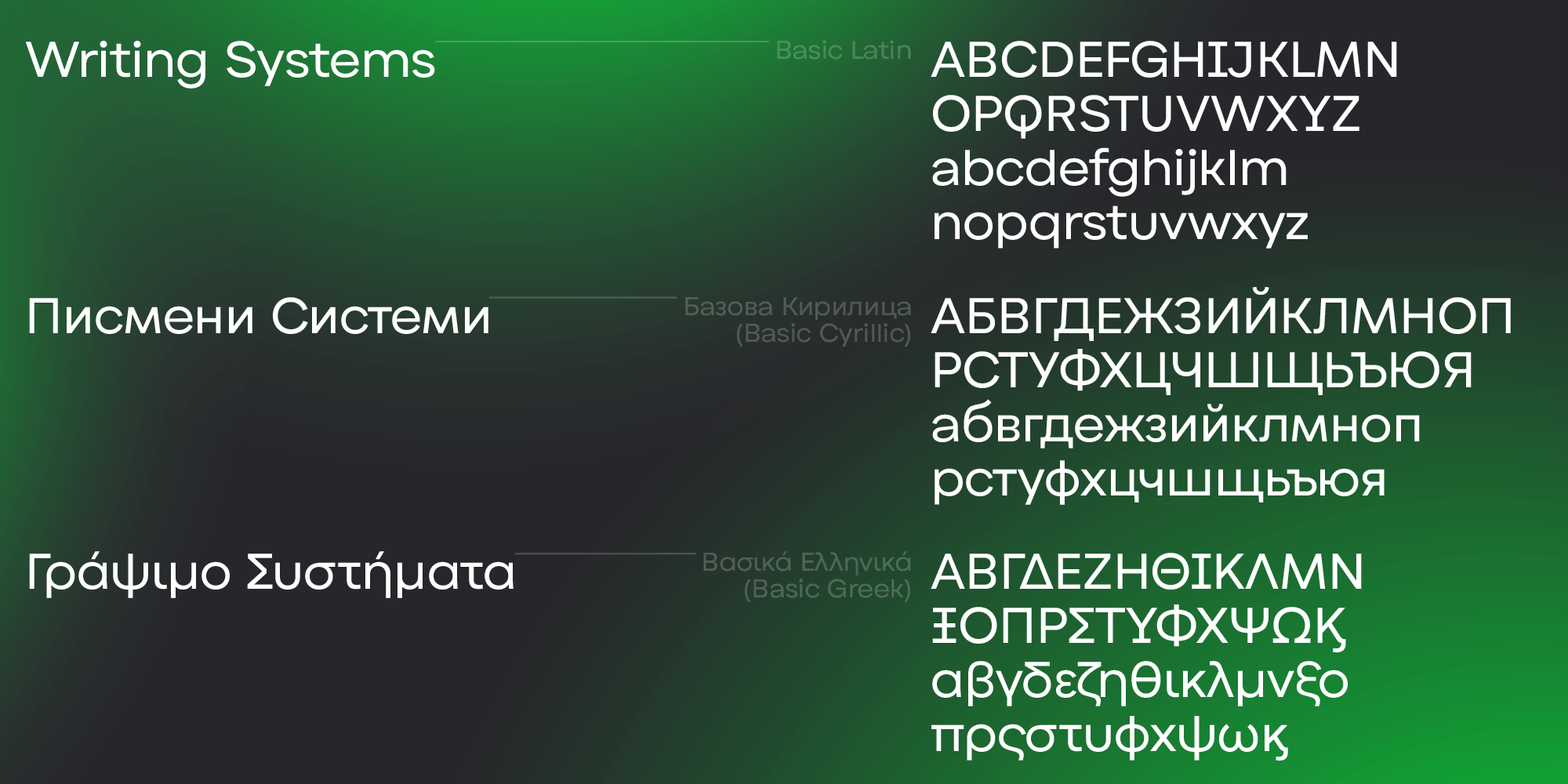
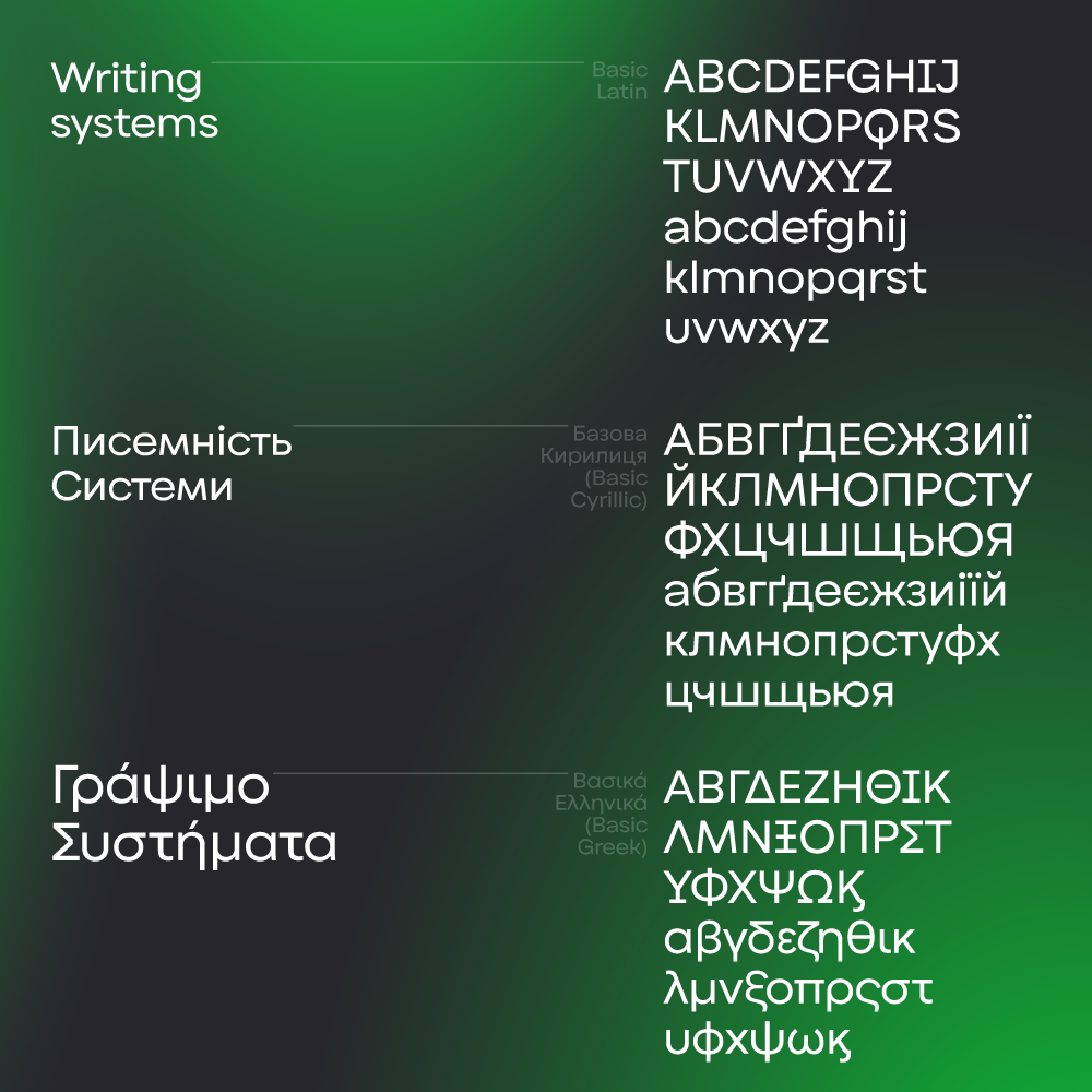
- Supports 220+ languages (Extended Latin, Cyrillic, Greek)
- Low stroke contrast
- High x-height with short extenders
- Slightly wide letterforms
- Mix of diagonal terminals (in c, e, s) and straight cuts (in t, f, r)
- Subtle asymmetries in letters like a, e, B, G
- Conventional sans-serif forms for steady reading flow
- Carefully tuned spacing and kerning across styles
_______________
OpenType features:
- Ligatures
- Stylistic sets
- Contextual alternates
- Tabular figures
- Fractions
- Ordinals
- Case-sensitive forms