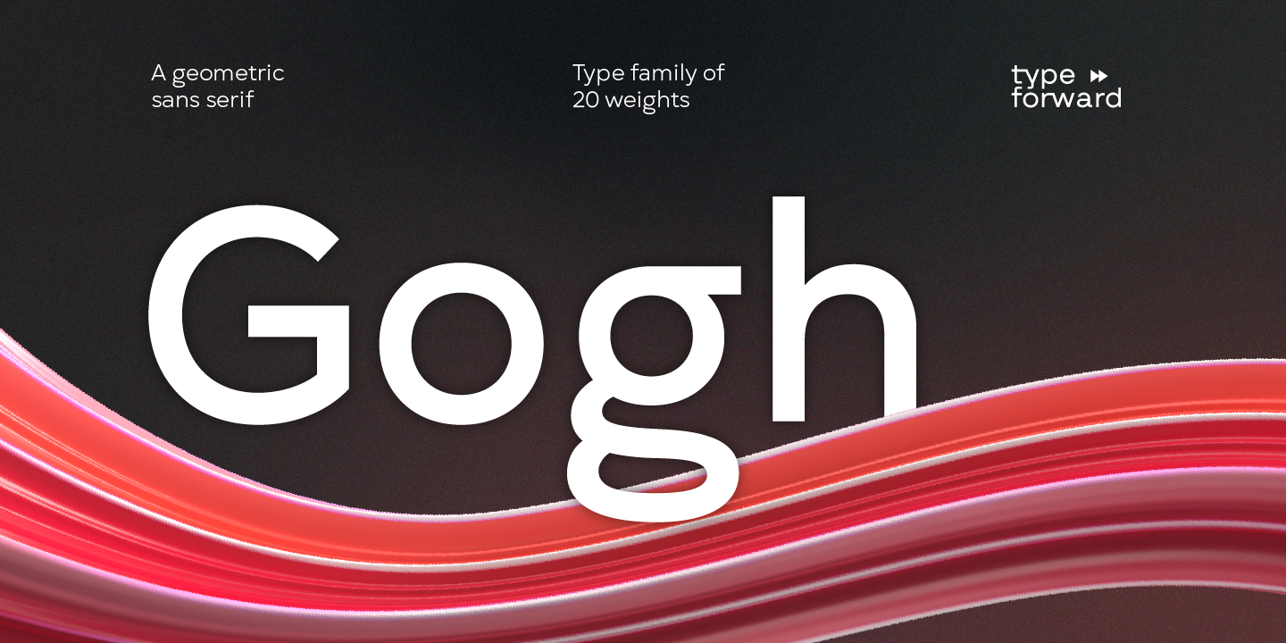
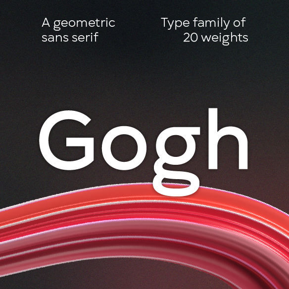
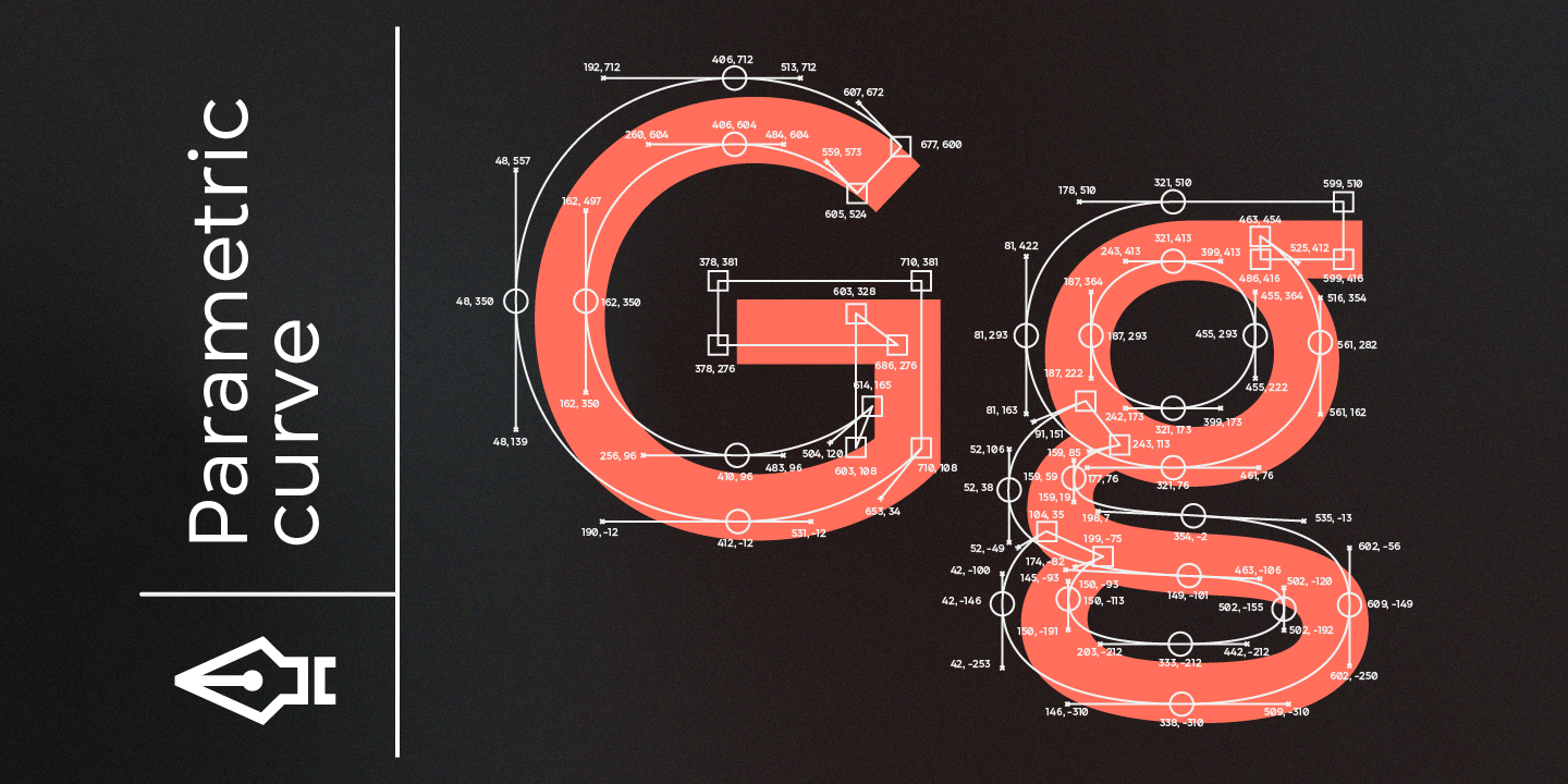
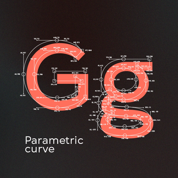
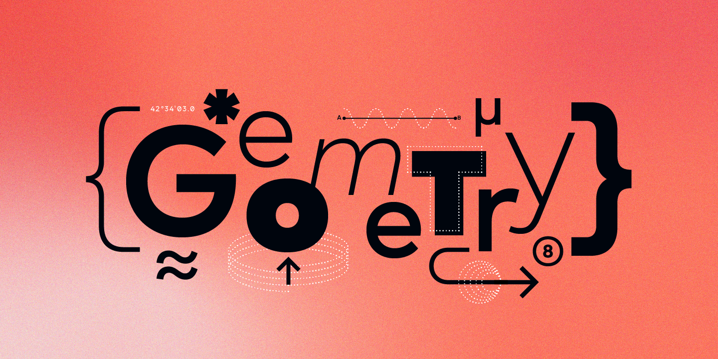
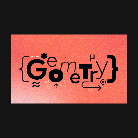
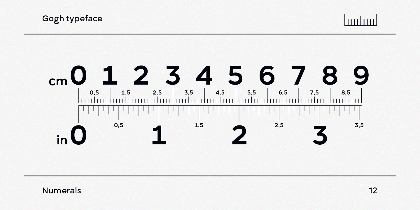
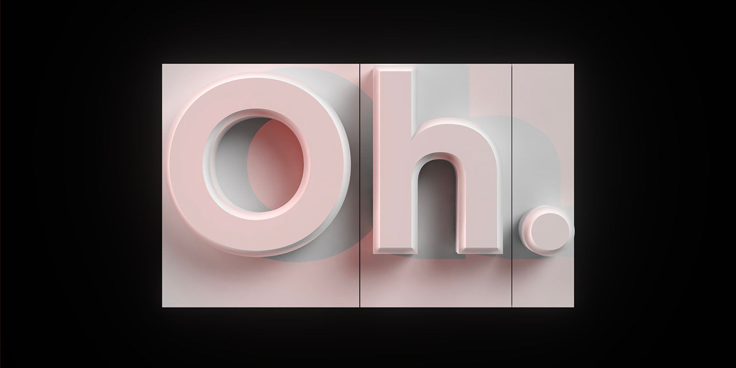
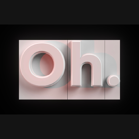
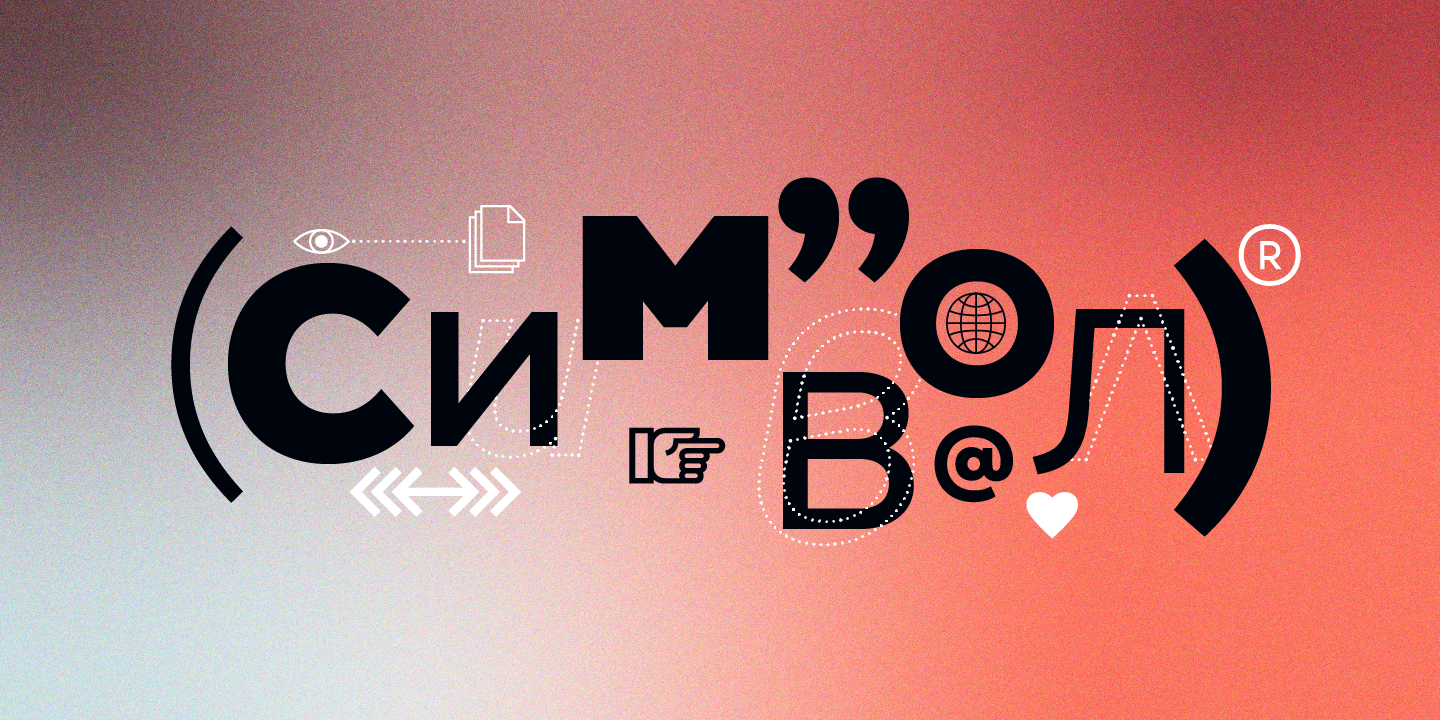
Gogh is a geometric sans serif with a modern look and traditional spirit.
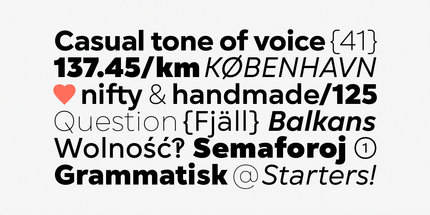
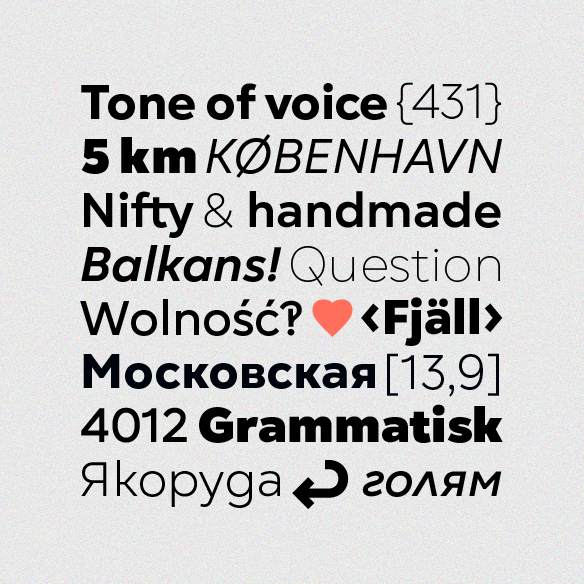
It blends evenly in a paragraph without being overly distracting to the reader. Yet it still keeps a rich and distinctive character. The generous x-height, easily distinguishable glyph forms, and open terminals are all designed to help the eye perceive a block of text smoothly, making it clearly legible. Gogh thrives when used both on-screen and in print media.
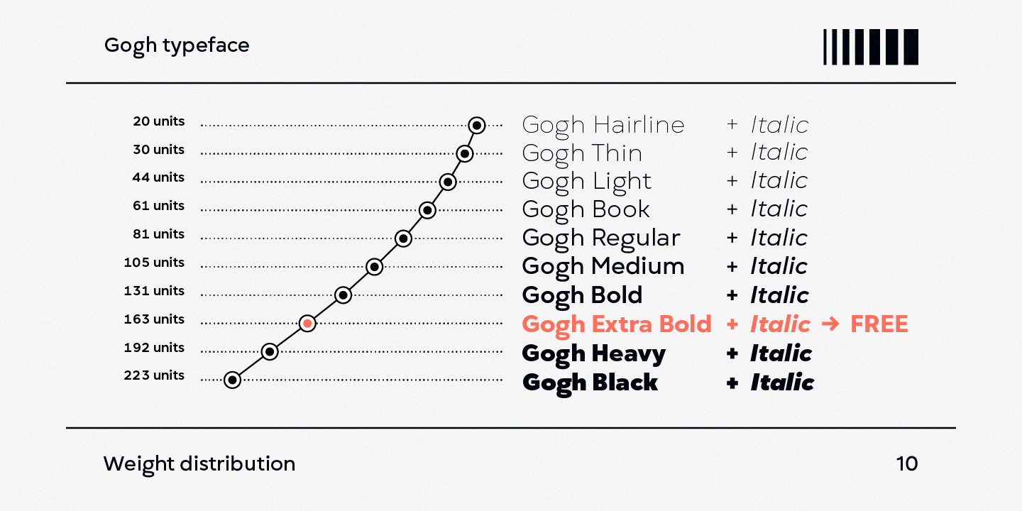
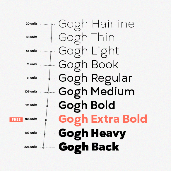
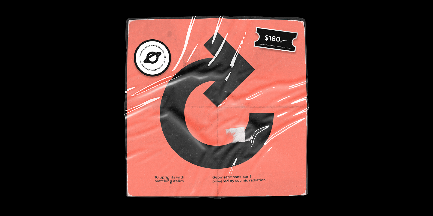
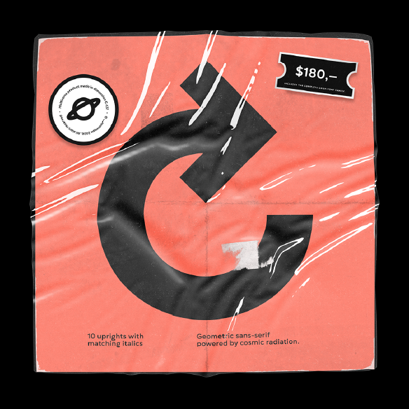
The Gogh type family consists of 10 weights, from Hairline to Black, and their matching Italics. Gogh is also available as a fully functional variable font, which gives unlimited opportunity to explore typography without the restrictions of predefined weights. Gogh Variable is also the best option if used on the web, as it has a much-reduced size compared to the original font family.
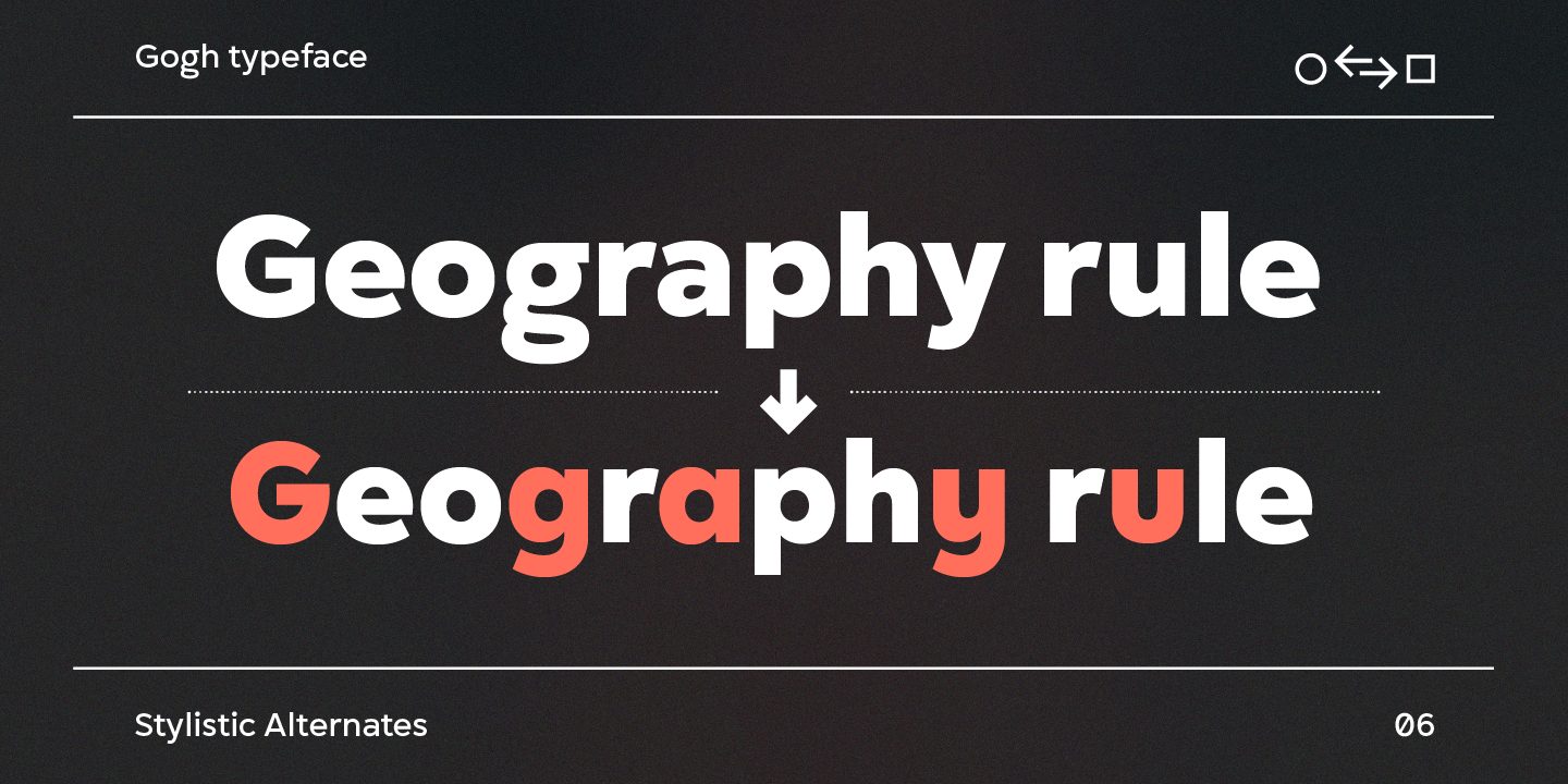
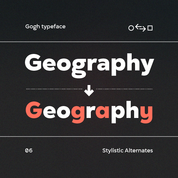
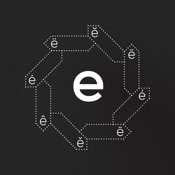
Regardless of which Gogh family you choose, the typeface covers a broad spectrum of languages, including Extended Latin and Cyrillic. And it also comes with an alternative stylistic set that will completely change the overall look of a paragraph, giving it a more contemporary and display appearance. In addition to that, Gogh type family is enriched with an extensive list of OpenType features for advanced typographic layout, including standard and discretionary ligatures, tabular and small figures, fractions, language localizations, case-sensitive punctuation, and more.