Karst
Overview
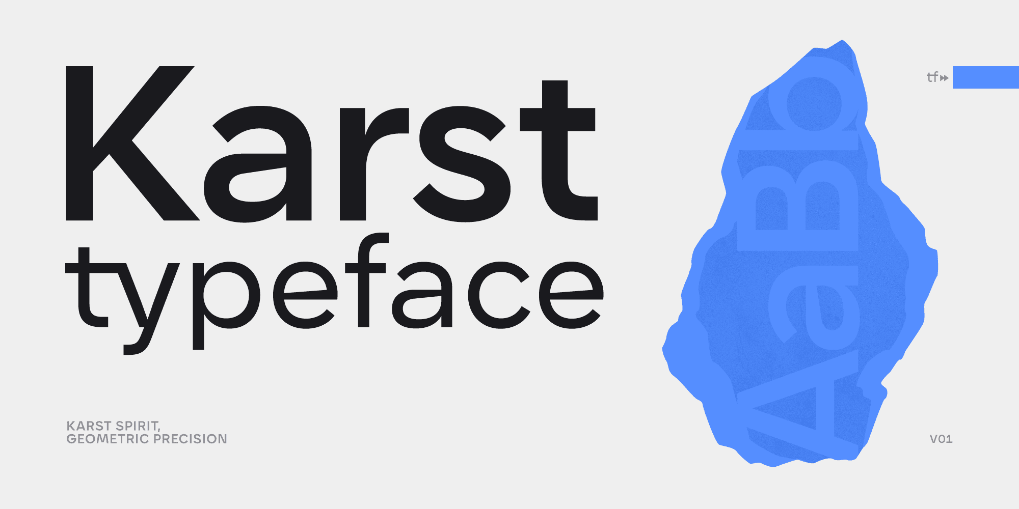
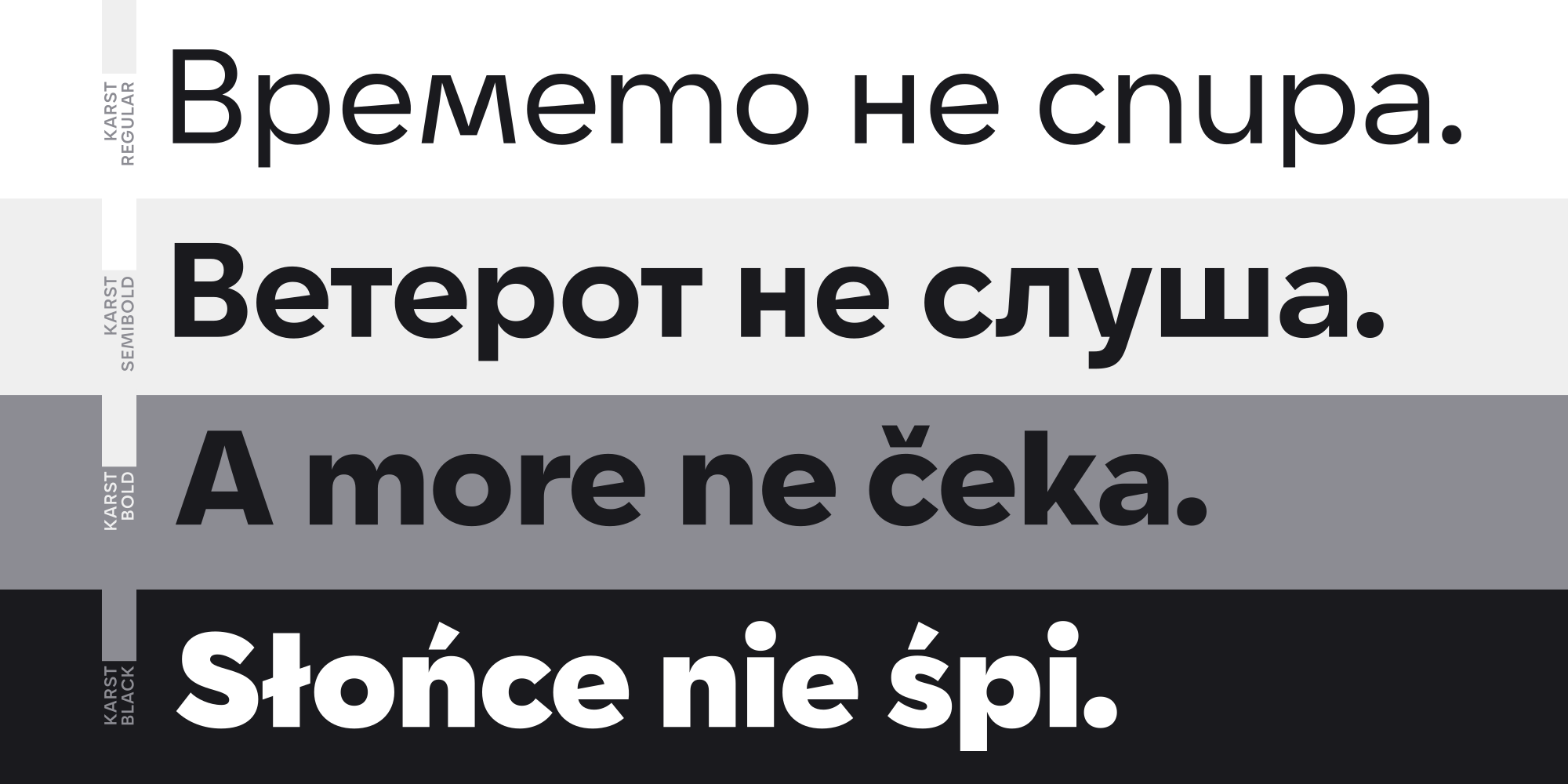
Karst is a geometric sans-serif typeface with a contemporary, edgy character.
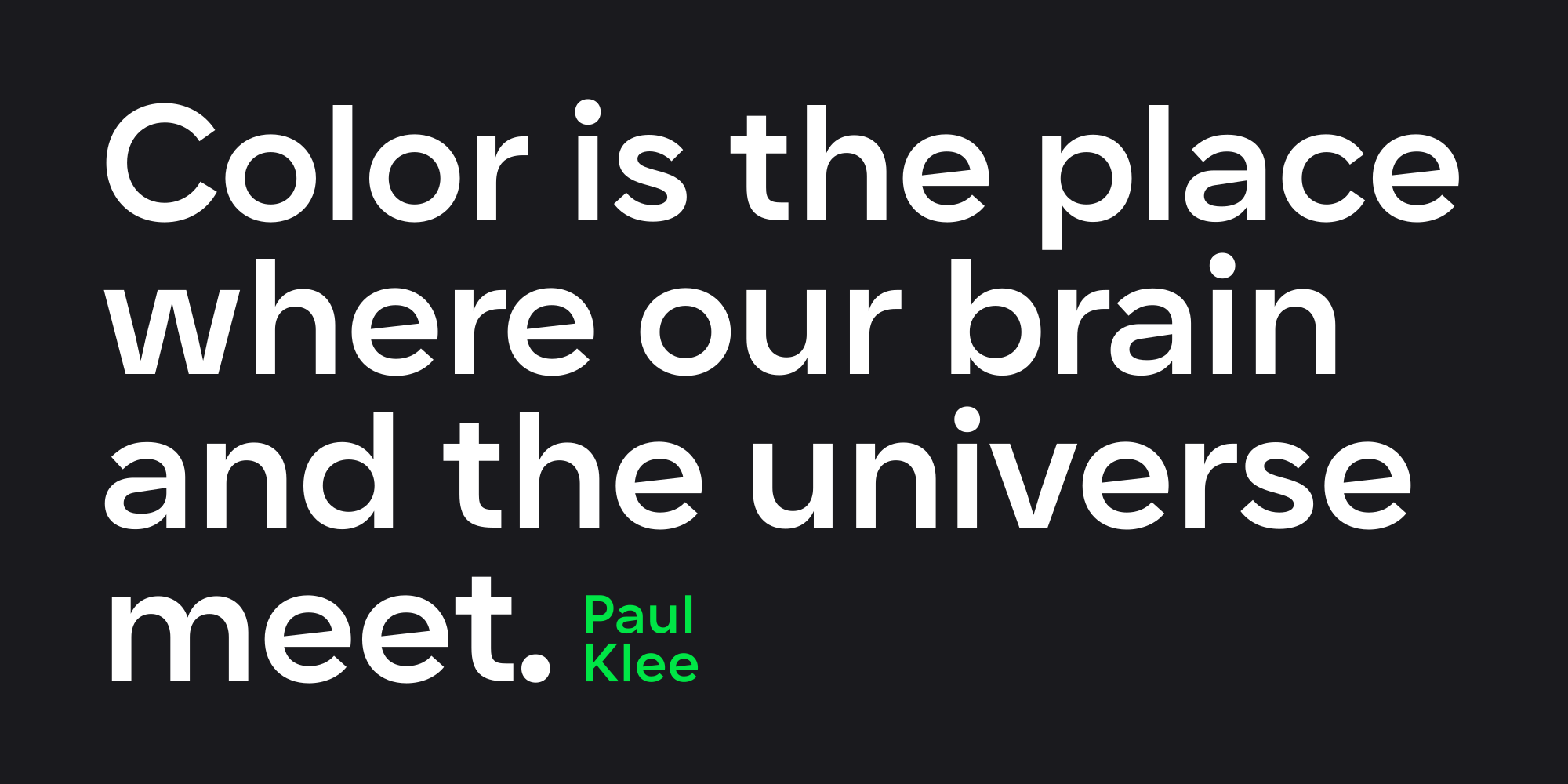
Karst combines geometric shapes with distinctive angles, ensuring clarity and readability. Its high x-height, minimal stroke contrast, and open letterforms make it suitable for both headlines and body text.
Inspiration:
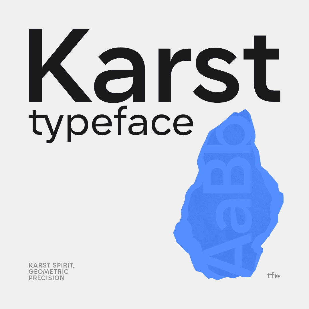
Karst is inspired by natural rock formations called Karst landscapes, known for their flowing curves and sharp edges. These contrasts influenced its precise geometric shapes and distinctive angles, making it visually appealing across web, print, branding, and editorial contexts.
Key Features:
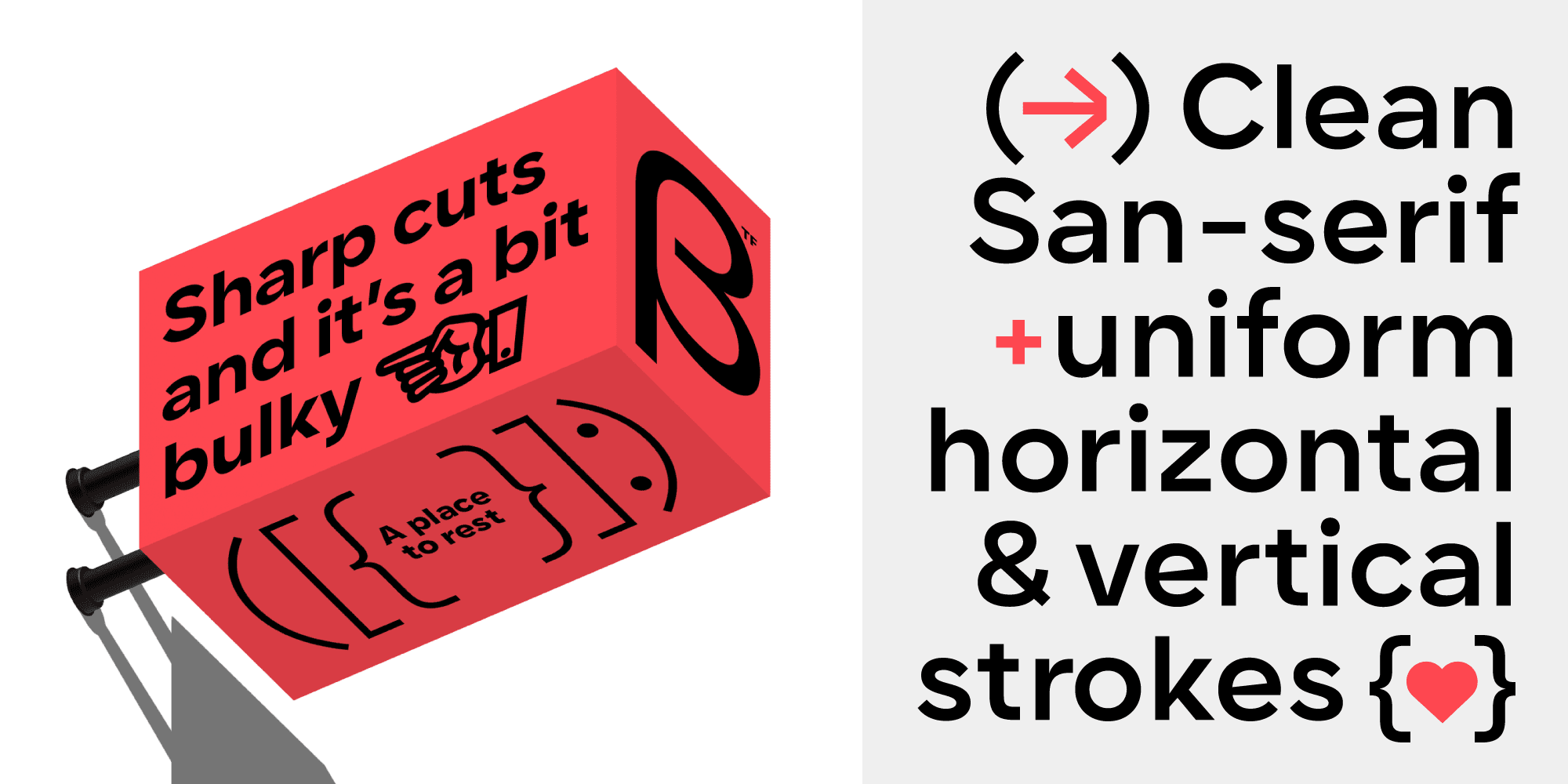
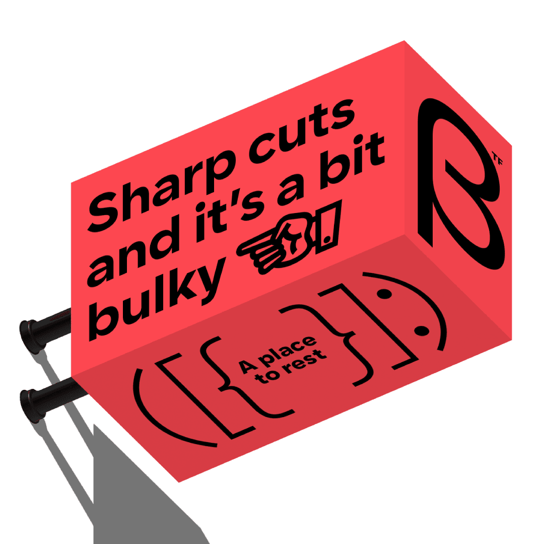
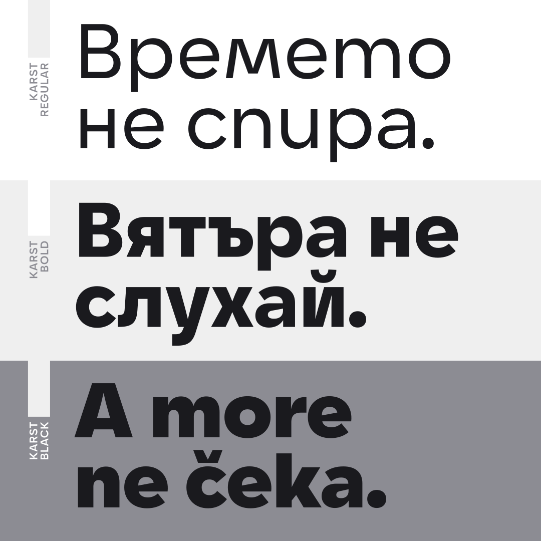
Karst features minimal horizontal and vertical stroke contrast. It has intentionally blunt and sharply cut endings and connections, particularly visible in diagonal letters such as “A,” “Y,” “K,” “M,” and “V.” Horizontal bars in letters such as “e” and “a” have sharp diagonal cuts with a lot of personality. The typeface conveys the feeling of modernity and strength.
Font Family:
Karst has 9 weights (Thin to Black) with matching italics for a total of 18 styles, available in OTF, TTF, web fonts, and a variable font format. The variable font includes two axes—weight and italic—allowing dynamic customization.
Technical Details:
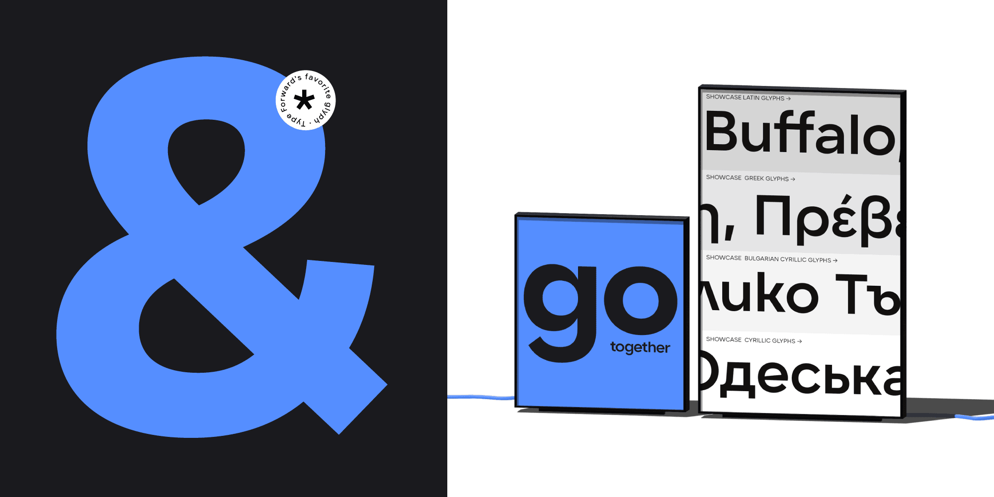
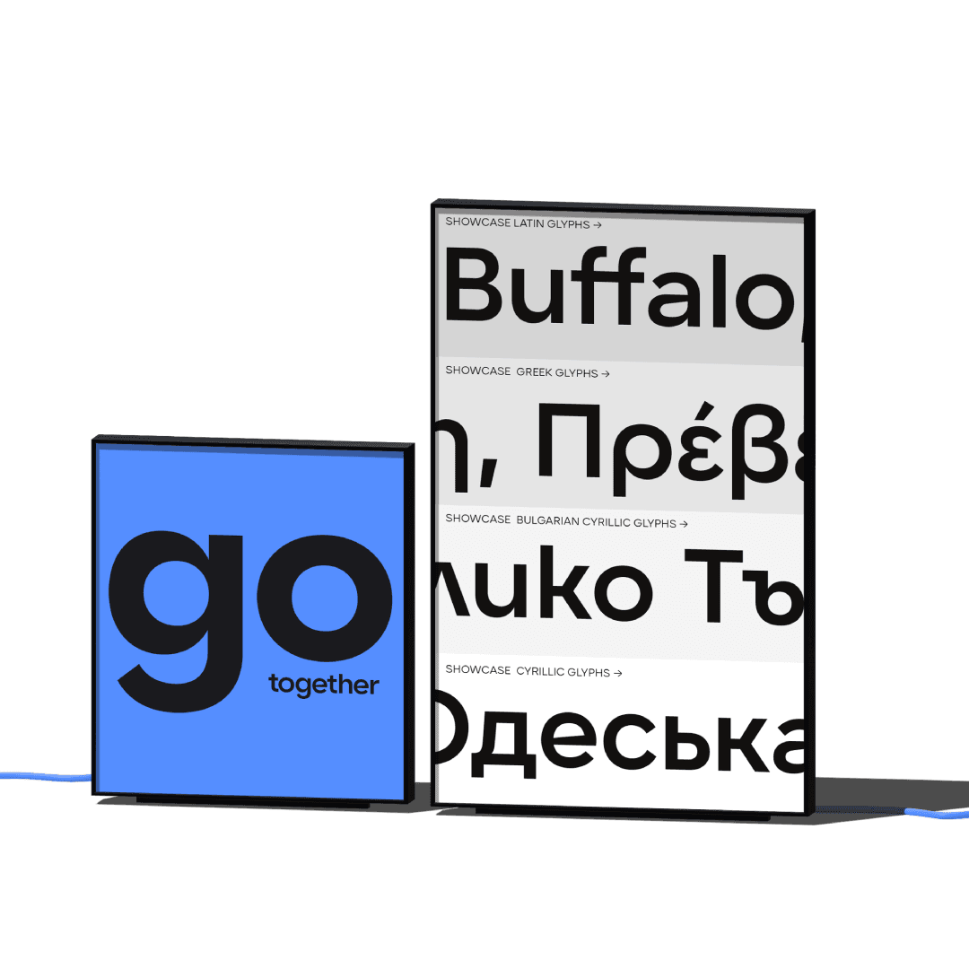
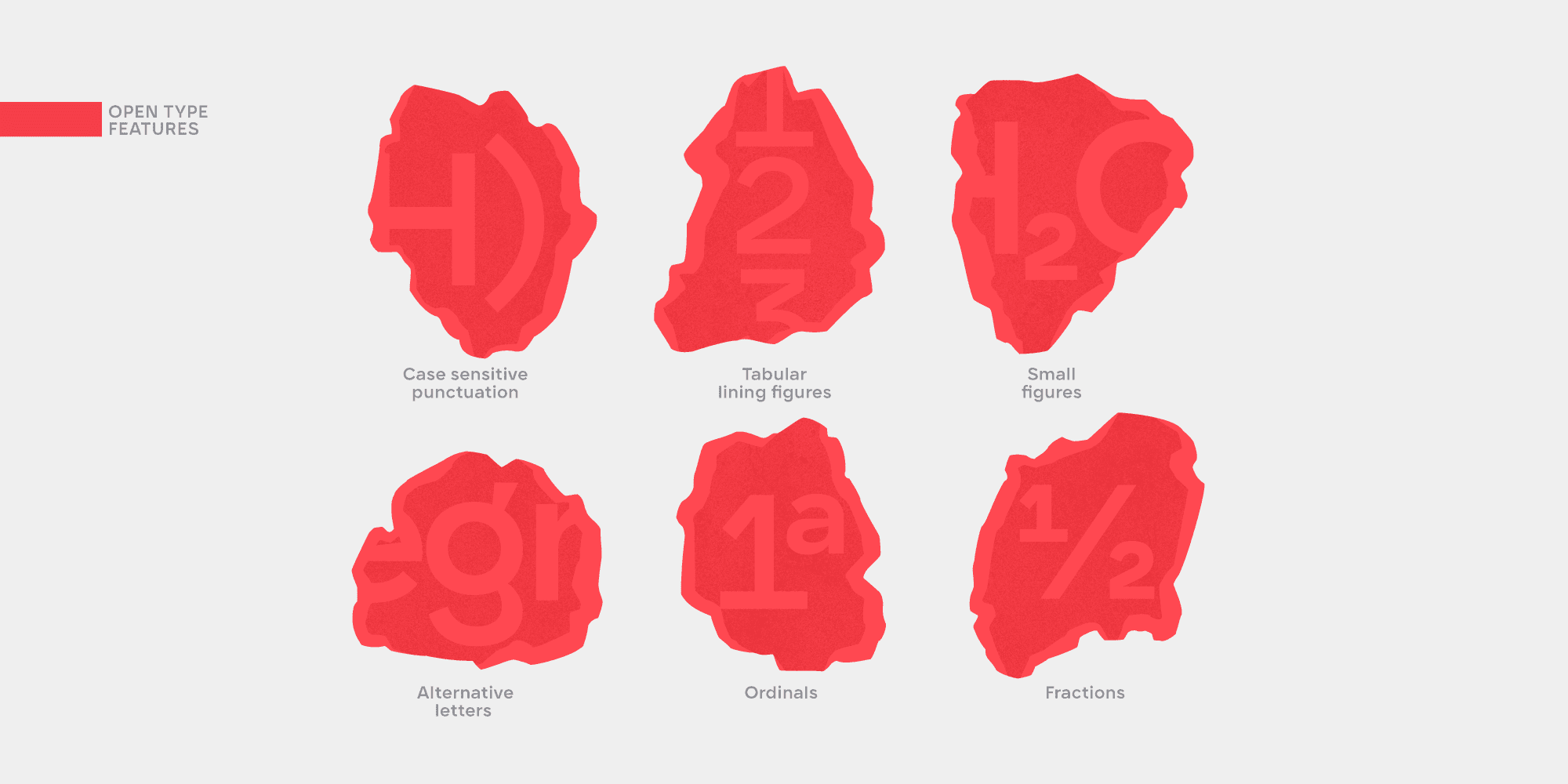
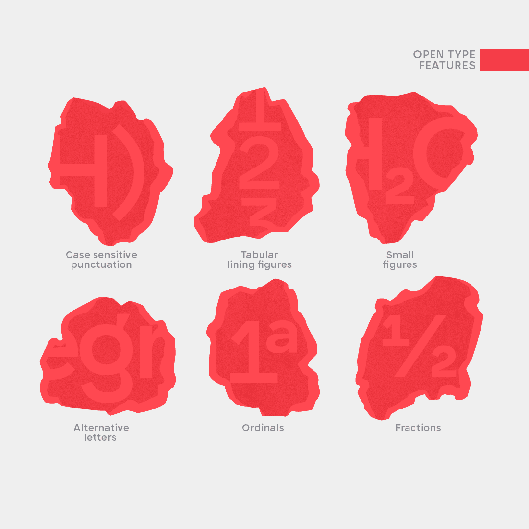
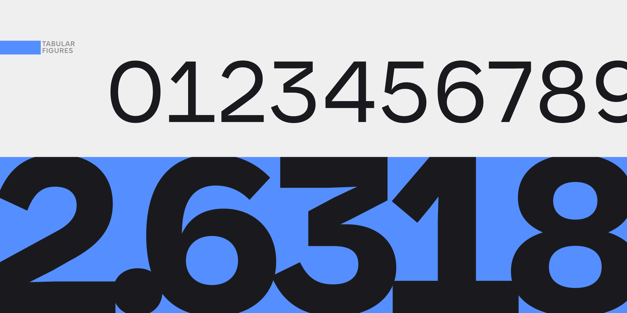
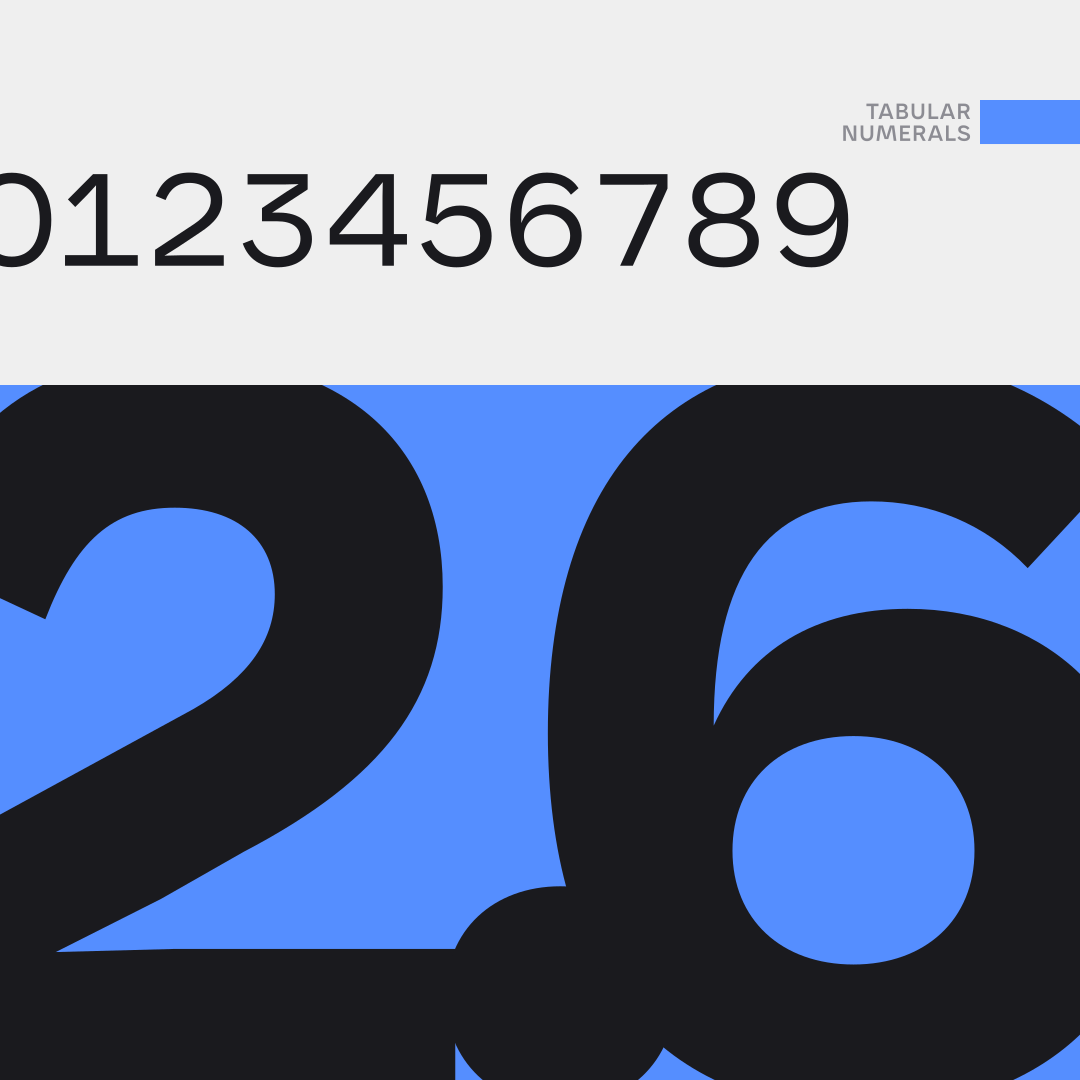
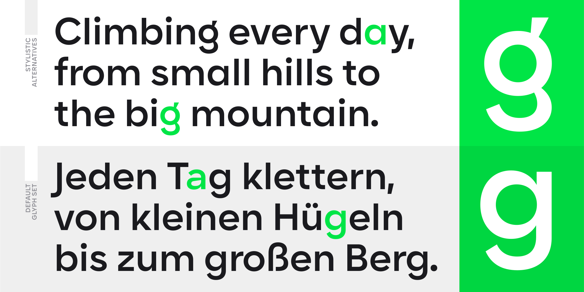
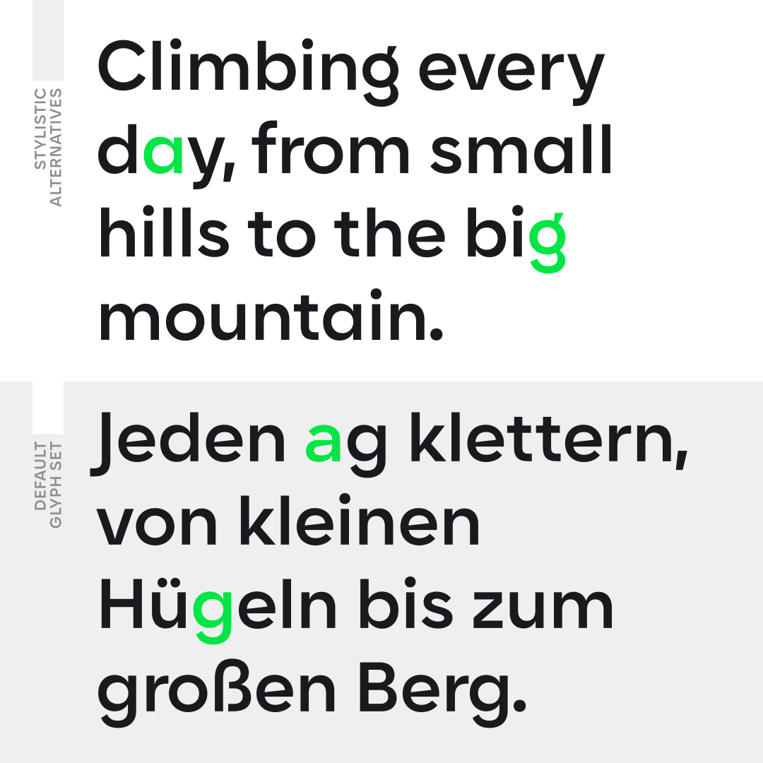
Karst supports over 220 languages, including Extended Latin, Cyrillic, and Greek. It includes advanced OpenType features, such as standard and discretionary ligatures, a stylistic set offering contemporary alternates for letters “a” and “g,” tabular numbers, small figures, ordinals, case-sensitive punctuation, and localized language forms.
Recommended Use:
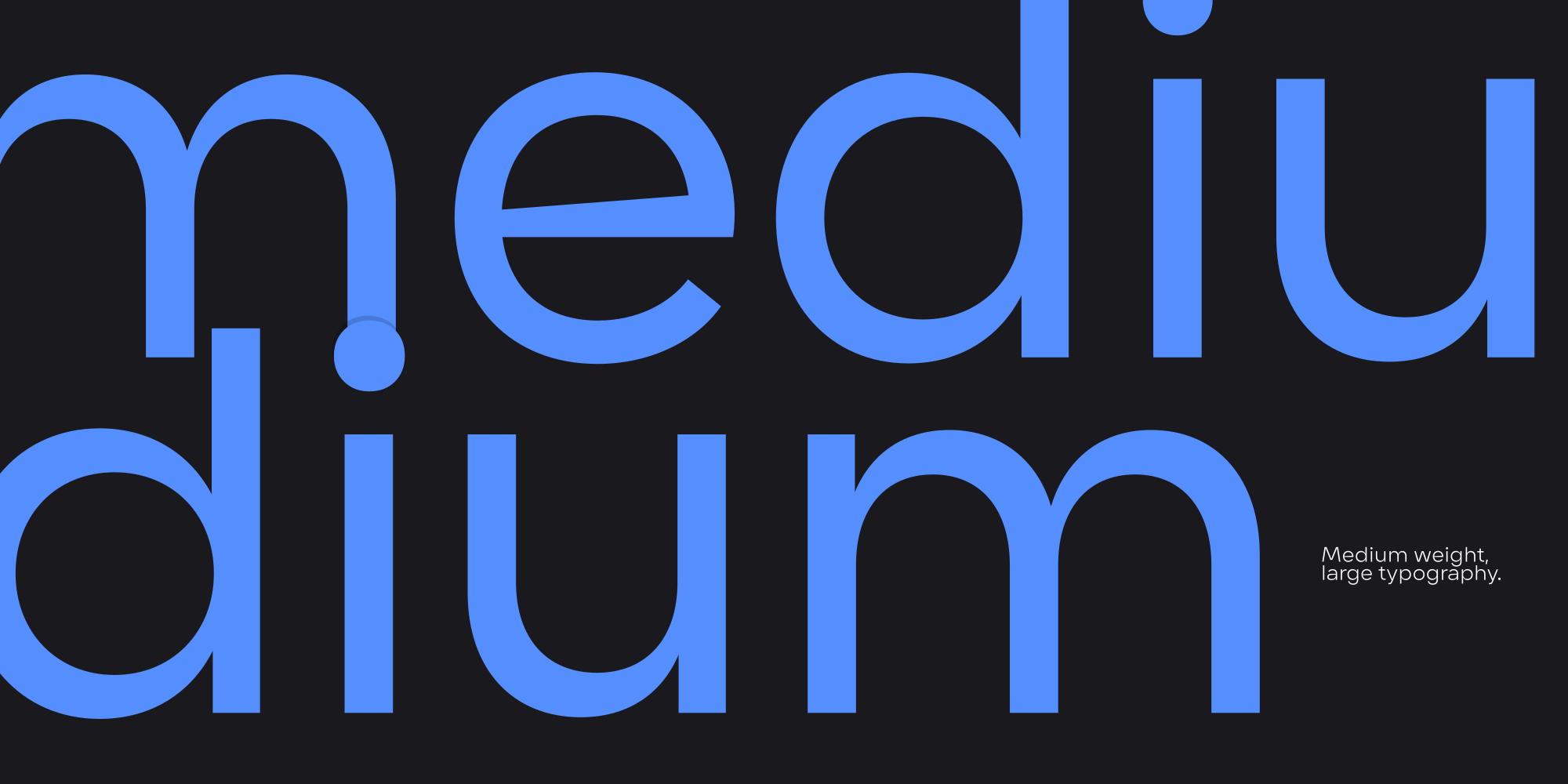
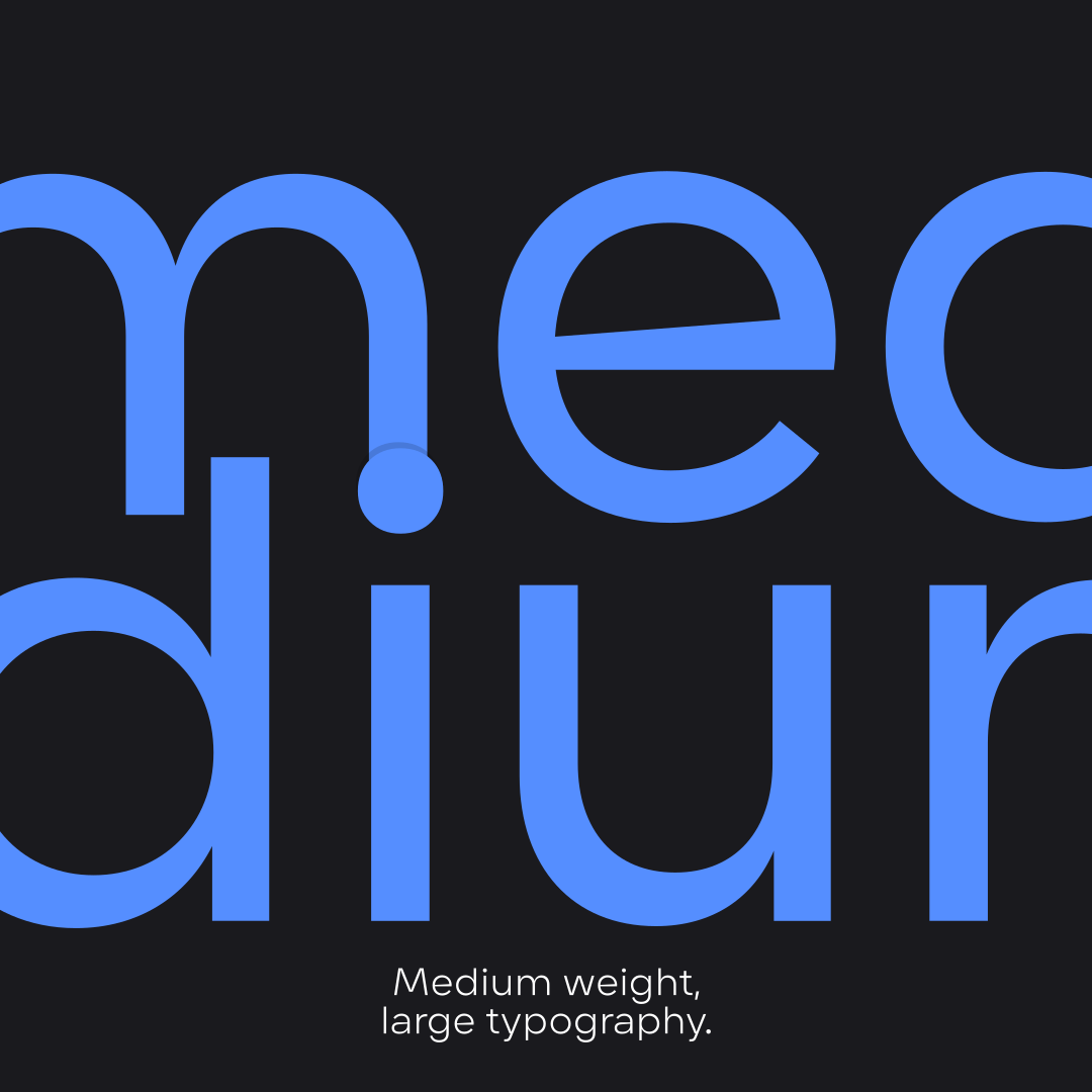
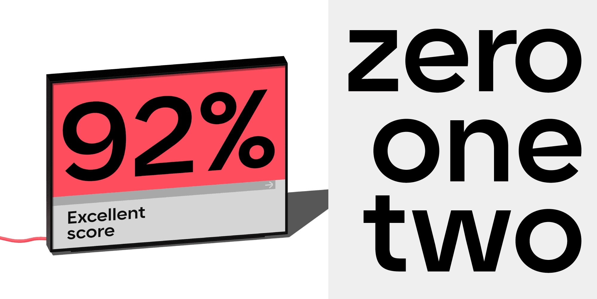
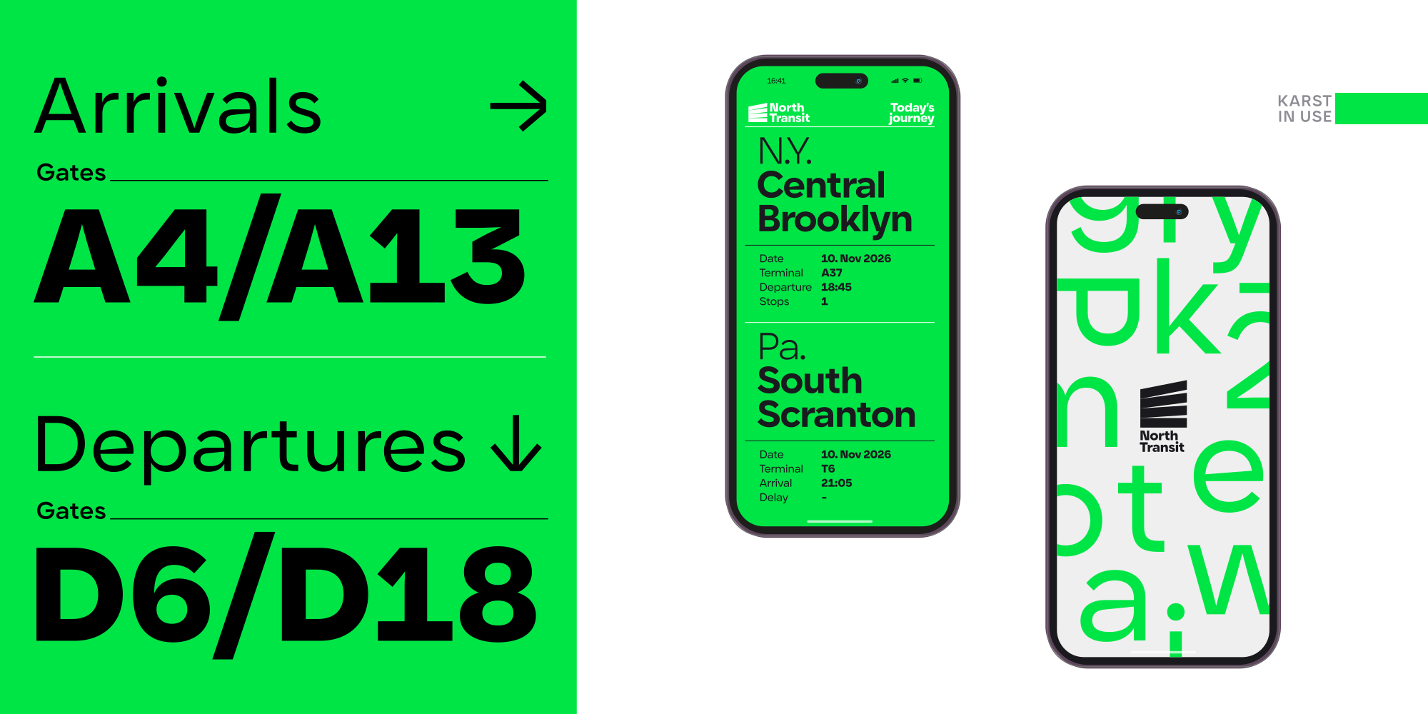
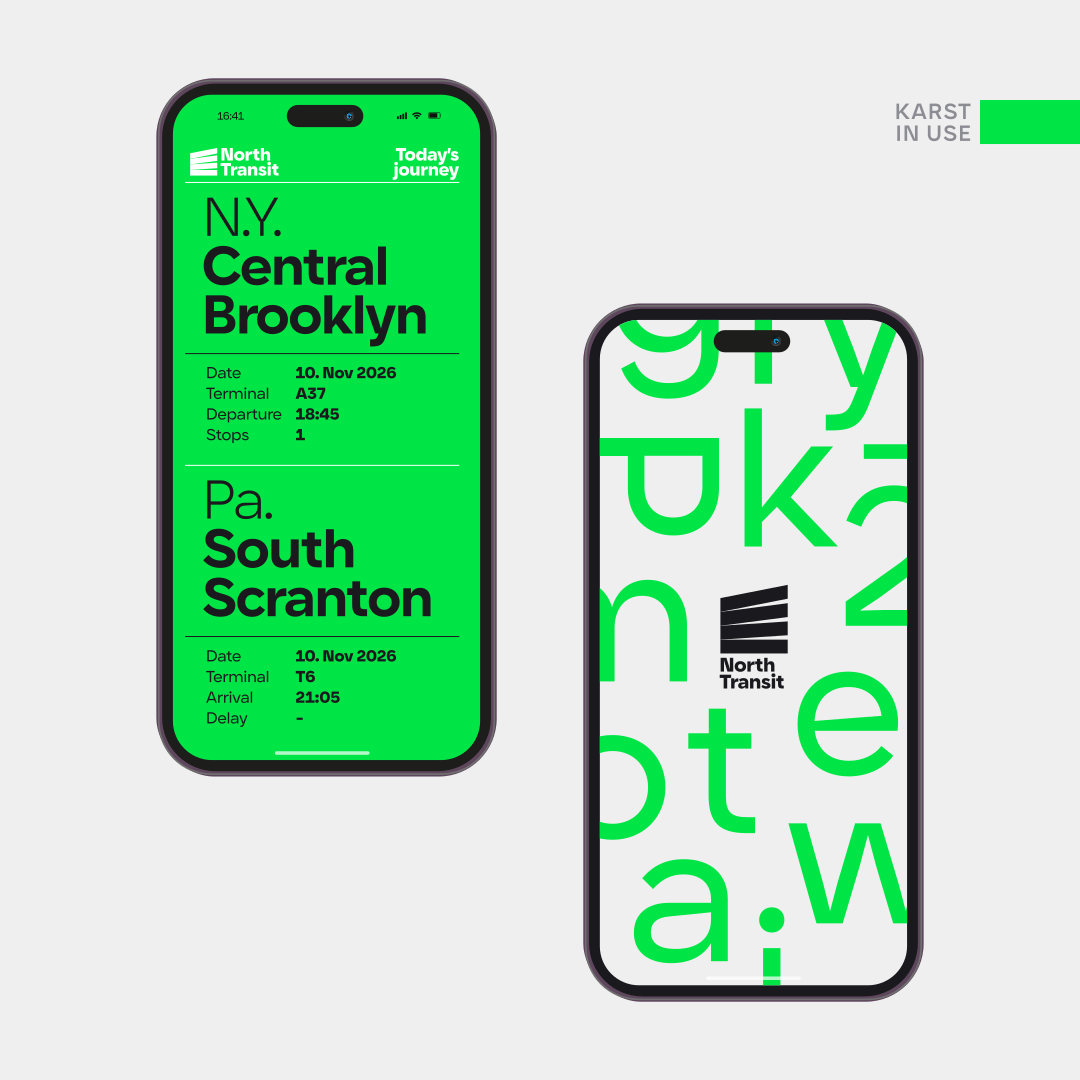
Karst works well across diverse projects. Extreme weights excel in headlines and branding, while medium weights remain legible in shorter, small-body texts, which would benefit from a modern, contemporary feel. It is optimized to perform equally well on screens and in print.
Overview:
Karst combines the clarity of geometric sans-serifs with unique contemporary details, making it distinctive and versatile for various design applications.
Typeface Classification:
- Geometric Sans Serif
Best Used For:
- Body Text
- Headlines & Titles
- Digital & Web
- Print Media
- Logos & Identity
- Branding & Editorial
Supported Scripts:
- Latin
- Extended Latin
- Cyrillic
- Greek
Karst gallery
Use the Previous and Next buttons, or the Left and Right Arrow keys while a gallery control is focused, to change slides.
Slide 1 of 15

Type Tester
OpenType Features
-
giant alternative letters
-
(HO) case-sensitive punctuation
-
flier standard ligatures
-
align ss01 – alternative stylistic set
-
style discretionary ligatures
-
ведър ss02 – oval cyrillic
-
здраве localized forms
-
акация ss03 – alternative oval cyrillic
-
GROß German Eszett
-
1/2 fractions
-
1a ordinals
-
H2O subscript figures
-
1437
6068 tabular figures
Inspect Karst’s stylistic options and see how they can alter the appearance of a paragraph.
Explore ligatures, subscript figures, fractions, language support, case-sensitive punctuation, and the stylistic sets included with Karst.
OpenType tag:
Family Overview
-
Karst Variable
-
Karst Hairline
-
Karst Thin
-
Karst Light
-
Karst Regular
-
Karst Medium
-
Karst SemiBold
-
Karst Bold
-
Karst ExtraBold
-
Karst Black
-
Karst Variable
-
Karst Hairline Italic
-
Karst Thin Italic
-
Karst Light Italic
-
Karst Regular Italic
-
Karst Medium Italic
-
Karst SemiBold Italic
-
Karst Bold Italic
-
Karst ExtraBold Italic
-
Karst Black Italic
Karst Regular
-
Karst Variable
-
Karst Hairline
-
Karst Thin
-
Karst Light
-
Karst Regular
-
Karst Medium
-
Karst SemiBold
-
Karst Bold
-
Karst ExtraBold
-
Karst Black
Karst Italic
-
Karst Hairline Italic
-
Karst Thin Italic
-
Karst Light Italic
-
Karst Regular Italic
-
Karst Medium Italic
-
Karst SemiBold Italic
-
Karst Bold Italic
-
Karst ExtraBold Italic
-
Karst Black Italic
Subscribe
You can unsubscribe at any time by clicking the unsubscribe link in the footer of our emails. By subscribing, you acknowledge that your information will be transferred to Brevo for processing.
Learn more about Brevo’s Privacy Practices (opens in a new tab) and Type Forward’s Privacy Policy (opens in a new tab).